Re-AK – A collaboration with Kalmar Atletklubb
2020 – RESEARCH INTERACTION DESIGN GRAPHIC DESIGN
PROJECT PARTNER: Greta Balog, anna mccarthy, deja de moss
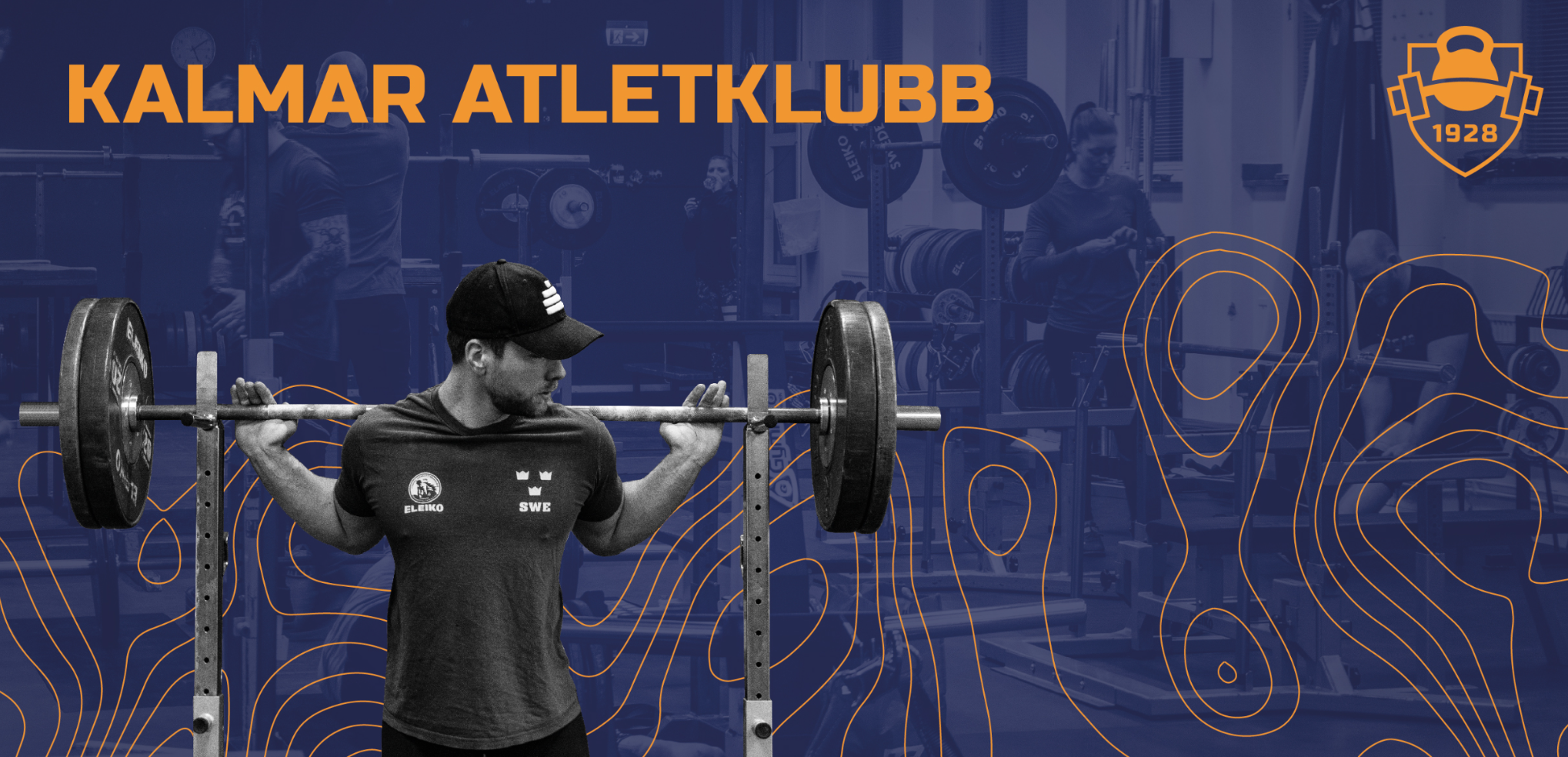
The new identity of the club doesn’t just lay in redesigning the logotype, but it has to be based on a well thought out concept and analysis of their core values as well as the main focus of what’s the club actually about, and later to communicate this reality. After the re-branding we focused on celebrating it with an open house event.
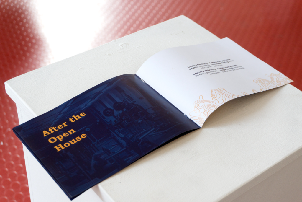
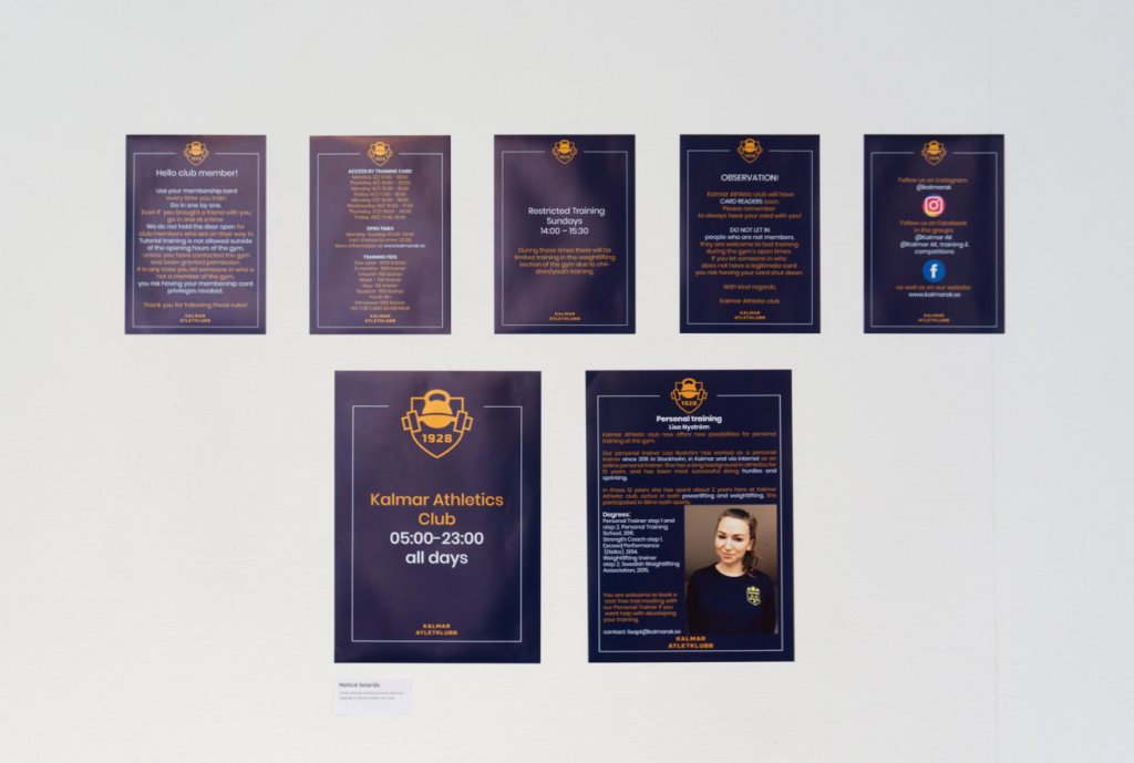
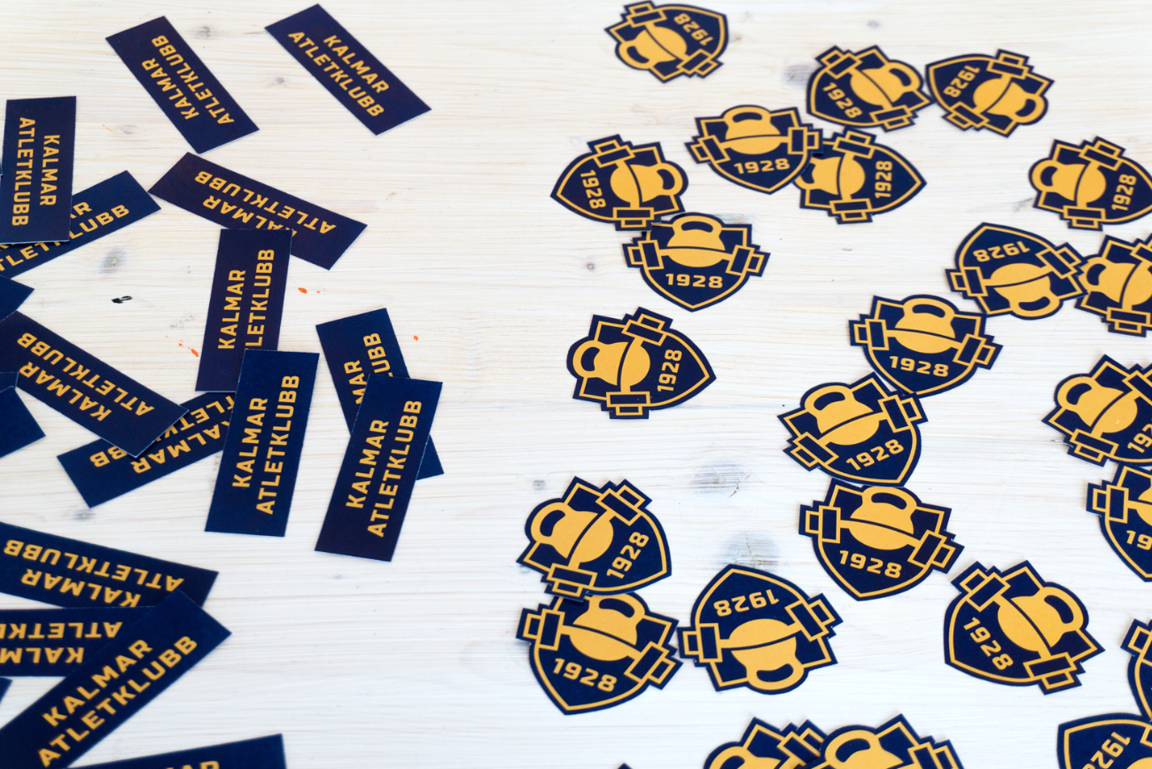
We created boklets, stickers, posters and banners as well as mock-ups for the team. Moreover, it is to be considered that working with a club whose history goes back to almost hundred years was a huge responsibility which required a lot of work and considerate decisions, built up on research and long discussions.
Research Question and Design Methodology
The open house could be understood as a bonus in our design project. It is the other half of it – we couldn’t have made the open house with the current’s club visual identity, neither we could have done the new visual identity without having a celebration of it – the open house event. This synergistic approach underlines the importance of both elements in fostering multiculturalism and inclusiveness, especially given that all promotional materials were created in English to accommodate non-Swedish speakers.

Inclusion Concept
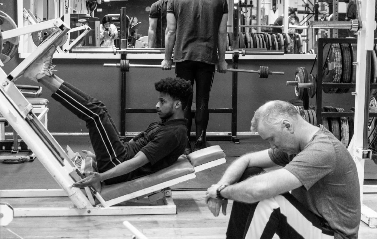
We created the project with the name RE-AK. AK is the Athletic club. RE comes from relaunch, rebranding, redesign, reform… and not the least, resilient. Our rebranding will make the club resilient – in a sustainable way, as it will be a long term change. This change will come along with its celebration, which will break people’s misconceptions about the club and constantly attract more nationalities, presenting the reality by giving people an insight into the club’s culture. We aimed for more inclusion as well as popularity. We used the English language, because of foreign people (working or not) or international students coming to Sweden – the first language they use if they don’t know Swedish, is English.
In terms of inclusion, we thought that coming at the open house and having a personal experience interacting with the club’s members and staff, it would make a stronger impact for them.
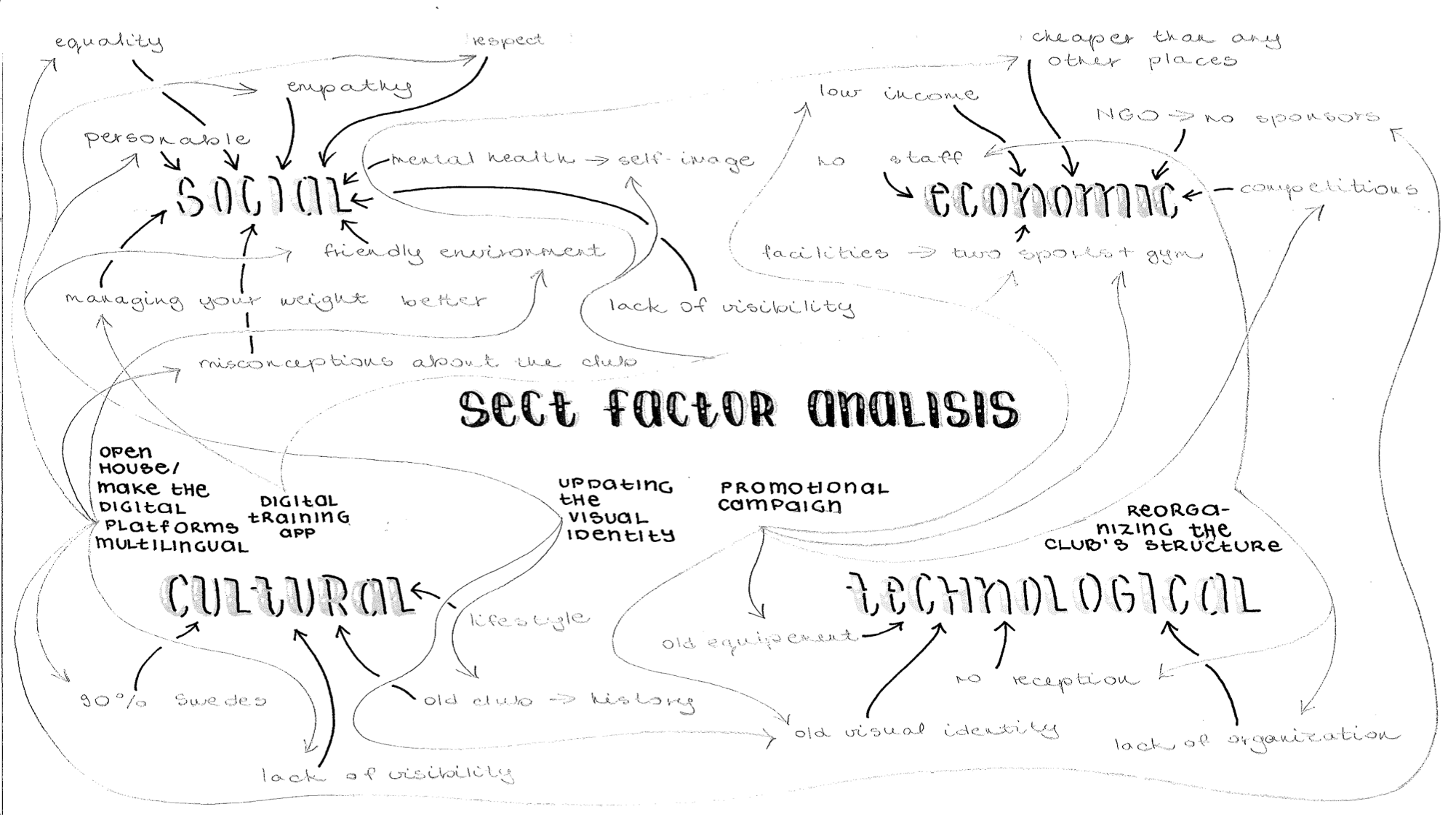
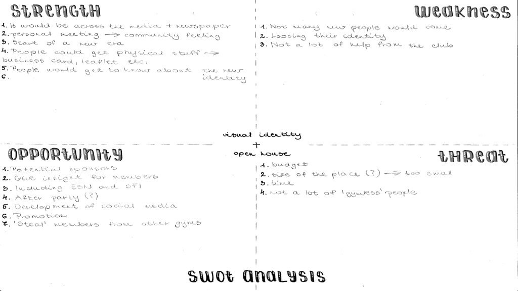
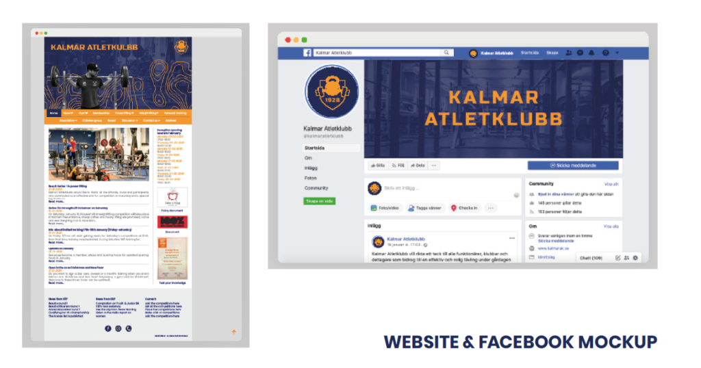
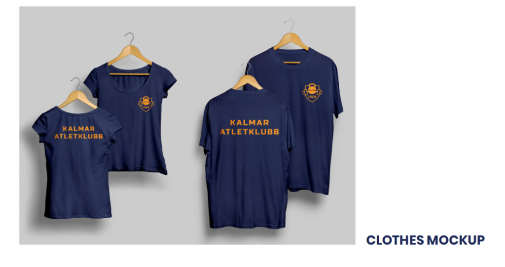
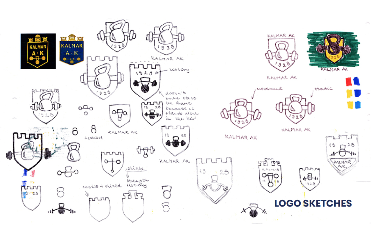
The rebranding of a company doesn’t lay in just redesigning the logo, and we were aware of that in our project. It has to have a really well though concept and analysis of the core values as well as the main focus of what’s the club actually about, to communicate the reality to the stakeholders, even by the colors – blue and yellow are complementary colors: yin & yang, boy and girl, opposites, differences that go well together.
Delivery
A folder which will contain a tool kit PDF with all the steps the board members have to do before, during and after the open house. The budget they will need for it to happen, all the materials they will need for it – such as a presentation for the open house with the script attached (so they can prepare). A new logo, a poster for the open house and last but not least, new posters with information for inside the club.
