Bookmyplay
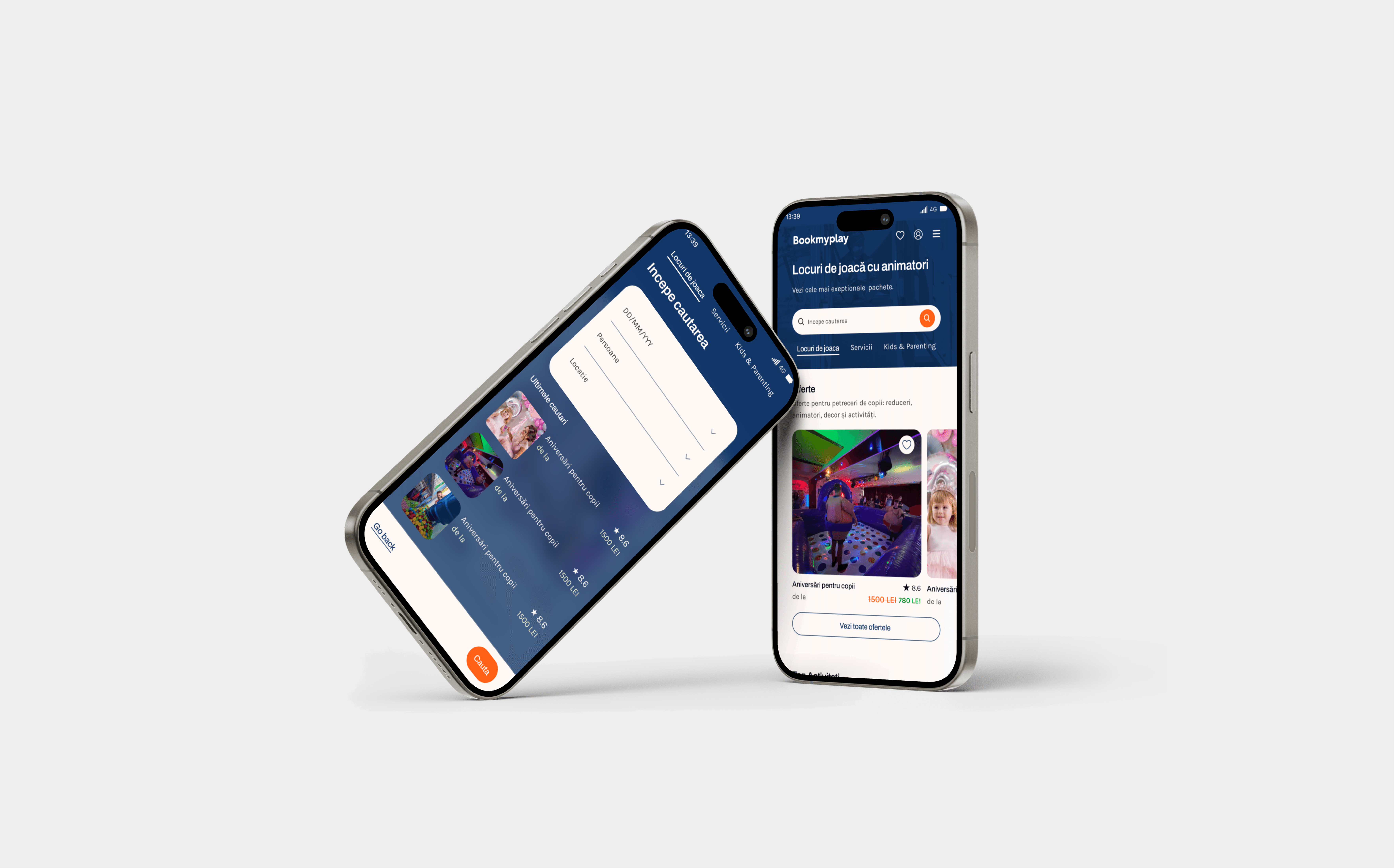
I redesigned the booking platform Bookmyplay, which connects parents with playgrounds and event services for children. Collaborated closely with the CEO and PM, and led the implementation together with the dev team.

Client: BookMyPlay
Industry: Events Booking Platform · Family Entertainment (B2C, B2B)
Timeline: 3 months | 2025
My Role: UX/UI Designer
Team: Project Manager, CEO, 5 developers
Contribution
Brought in to lead the complete redesign of BookMyPlay.ro after the client was dissatisfied with the previous direction. I redefined the platform’s design system, improved accessibility, and ensured a pixel-perfect, mobile-first implementation in close collaboration with the developers. My focus was on improving hierarchy, responsiveness, and inclusive design while retaining the platform’s playful, family-oriented identity.
Competences.
UX audit · UI redesign · Visual hierarchy · Accessibility design · Design system · Developer collaboration · Mobile First Design · Responsive prototyping

Click on the image above to go to the website
Challenge
BookMyPlay’s platform had strong back-end functionality but lacked visual clarity, accessibility, and responsive consistency. The design felt generic and failed to communicate the warmth of a family entertainment brand. On mobile, layout and hierarchy broke easily, creating friction in booking and browsing experiences.
How might we redesign BookMyPlay to enhance usability, accessibility, and visual cohesion while maintaining the warmth and trust of a family-friendly brand?

Approach
I started with a UX and accessibility audit, identifying key friction points in navigation, color contrast, and booking flow. The redesign focused on clean visual structure, color-coded content blocks, and intuitive navigation.
Working iteratively, I aligned with the dev team to ensure all components were WCAG 2.1 compliant, optimized for performance, and consistent across breakpoints. I also refined interaction states, button feedback, and empty/error states — previously neglected areas that directly impact usability.
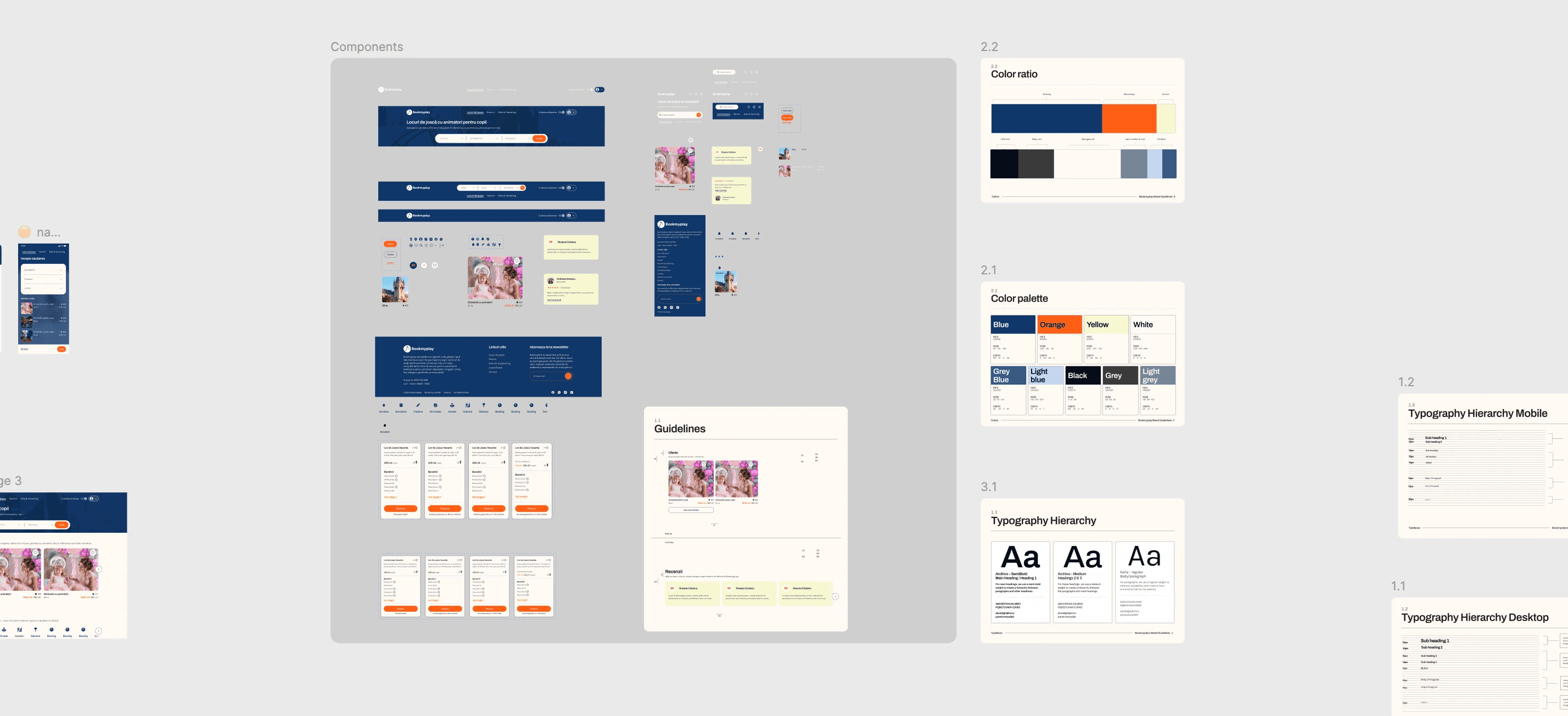
On the technical side, I created Figma-based tokens and variables for colors, spacing, and typography to support a unified design-to-code workflow. The design system was structured around atomic principles, enabling developers to reuse patterns with minimal QA friction.
Activities.
UX & Accessibility Audit · Visual Hierarchy Redesign · Color & Typography System · Responsive Grid Definition · Component Library Setup · Interaction State Documentation · Developer Handoff & QA Support · Accessibility (WCAG 2.1 AA)

What I Analysed.
Clarity and visual hierarchy of event cards and pricing layout.
Analized the hierarchy and storytelling of the homepage.
Readability and color contrast on bright backgrounds.
Ease of navigation between home → event → checkout flows.
Responsiveness and alignment across mobile, tablet, and desktop.
Visibility of primary CTAs (Book Now / Buy Tickets).
Accessibility of iconography and keyboard focus states.
What I Changed.
Introduced a 12-column responsive grid with consistent spacing.
Deleted the "subscribe" section from the homepage page and added it in the footer.
Simplified event cards with stronger visual hierarchy and defined CTAs.
Adjusted container widths for better scan rhythm and vertical spacing.
Defined a new color palette balancing joyful tones with strong contrast.
New Unified typography (two-typeface system for brand and content).
Built a Figma component library of all the reusable elements.

Accessibility & Inclusivity.
Increased contrast ratios to meet WCAG 2.1 AA.
Standardised focus indicators and hover states.
Enlarged tap targets and ensured all icon buttons had aria-labels.
Ensured proper heading hierarchy and semantic HTML mapping for devs.
Documented all interactive states and micro-animations for implementation.
Result
Delivered a responsive, visually cohesive, and inclusive booking experience that communicates reliability and playfulness. The new design improved content scannability, fixed mobile inconsistencies, and reduced booking friction. Post-launch metrics showed higher engagement time and no visual rework requests from stakeholders. The delivery was also accompanied with indications for all the interactions.
Deliverables.
Accessibility report · Redesigned UI layouts · Design Tokens · Color & Typography Guidelines · Component Library · Developer-ready handoff

Learnings
Designing accessible platforms at scale means balancing technical precision with emotional tone. Consistency across breakpoints and tokenized systems saves time and ensures long-term stability. Direct collaboration with CEO and developers compared to only the PM shortens review cycles and aligns the expectations with the result.
Takeaway.
I delivered a ready-for-development, scalable redesign that improved usability, accessibility, and brand perception. The project reinforced the value of accessibility as a design accelerator—not a limitation—and positioned BookMyPlay for long-term maintainability and trust.
Live website: https://www.bookmyplay.ro/