Omaia Health
Omaia is a digital wellbeing product for anxiety and fear around pregnancy and childbirth. I took it from early concept to closed beta, designing the programme, the interface and the AI companion's behaviour, and the validation system.

Role Product Designer (AI-Native)
Timeline 14 months · 2025–2026
Stage Concept → Alpha → Research → Beta → Validation
Team Founders, clinicians, researchers, designers, developers, prompt engineer
Website: omaia.ai
Detailed flows and visuals limited under NDA.
What I owned
Alpha design and Beta rebuild · research that changed the product · full UX/UI and design system · Maia (AI companion) behaviour · MVP validation approach and reporting · Support Circle concept
01 · The challenge
The founders knew the who and the why: pregnancy apps focus on the baby, while the person carrying the pregnancy can feel unseen. What was missing was the what and the how.
How does clinical knowledge become useful to someone who is anxious, tired, or looking for reassurance — without becoming another source of medical information to worry about?
The pregnant person is the user, not the baby.
02 · Alpha: building something to learn from
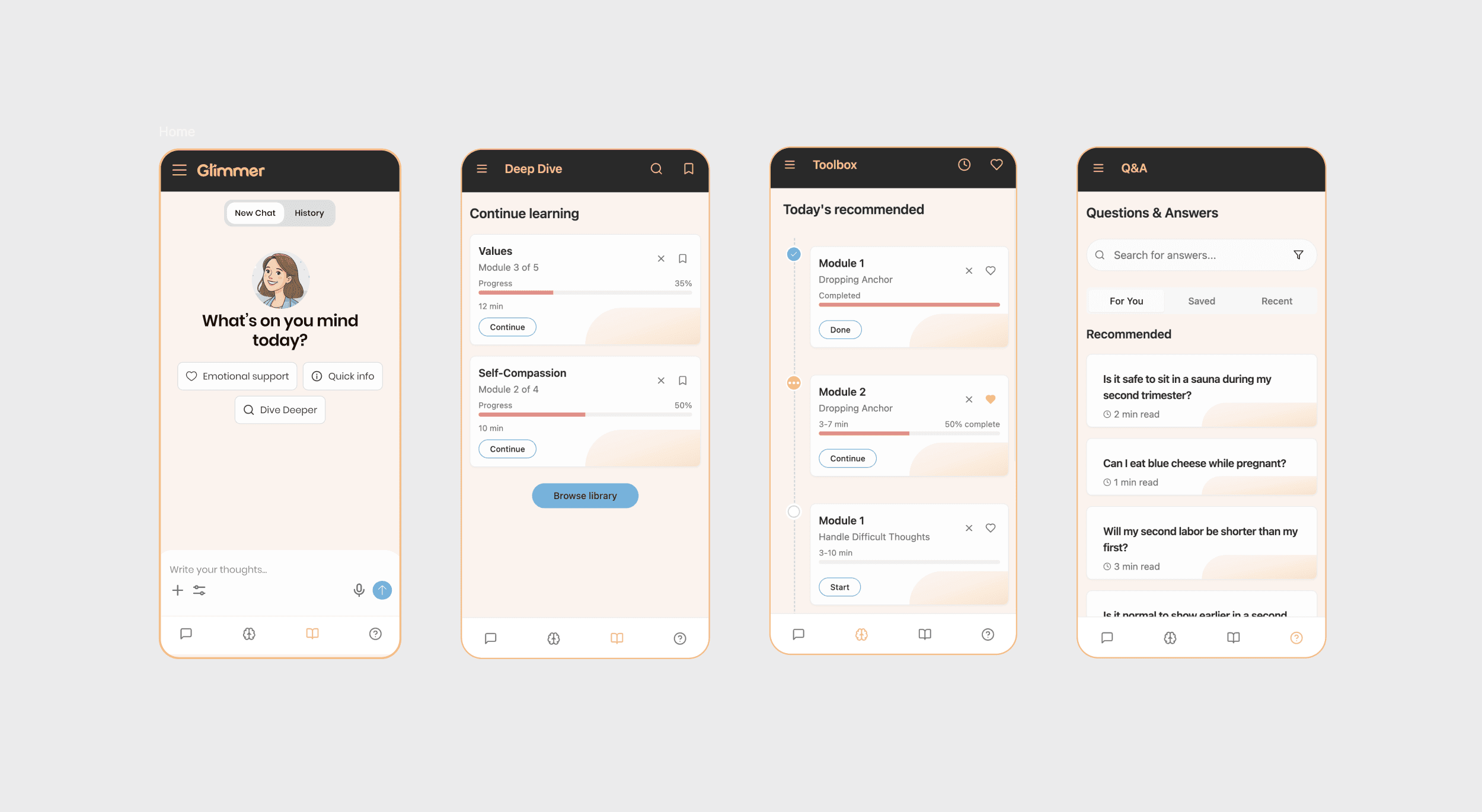
I built the Alpha as a working prototype in Lovable (after initial Figma work), pushed it to GitHub and hosted it. It paired informational articles with therapeutic exercises in a light interface. Deliberately broad. The question was simply: do people understand this, trust it, and come back?
I planned and ran the first research round on that build — recruitment, interview materials, usability tests on the live prototype, synthesis — and brought in a UX researcher I'd worked with before to strengthen it.
The findings showed the Alpha needed more than visual refinement. The product model had to change.
What we learned | What changed for Beta |
|---|---|
Long-form content demanded too much attention | Articles replaced with short interactive exercises |
Pregnancy anxiety isn't one uniform experience | Personalised pathways introduced |
Users needed a clearer way to return and see progress | Home and Progress created, with Trends and Pregnancy views |
The light interface felt bright and clinical | Redesigned around a calmer dark system |
Support often involved partners or family | Opportunity documented — later became Support Circle |
→ Research visibly changed the product, not just the pixels.
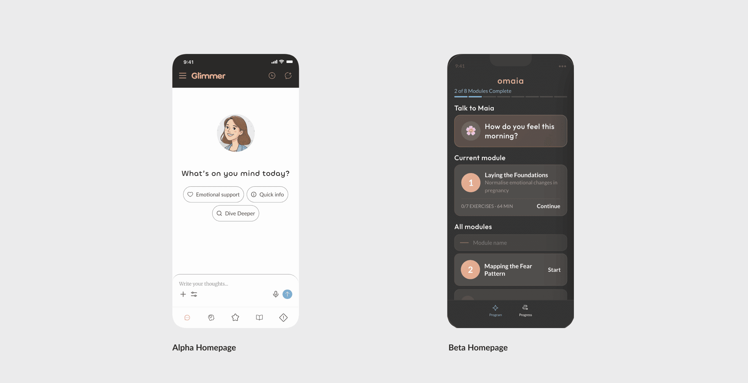
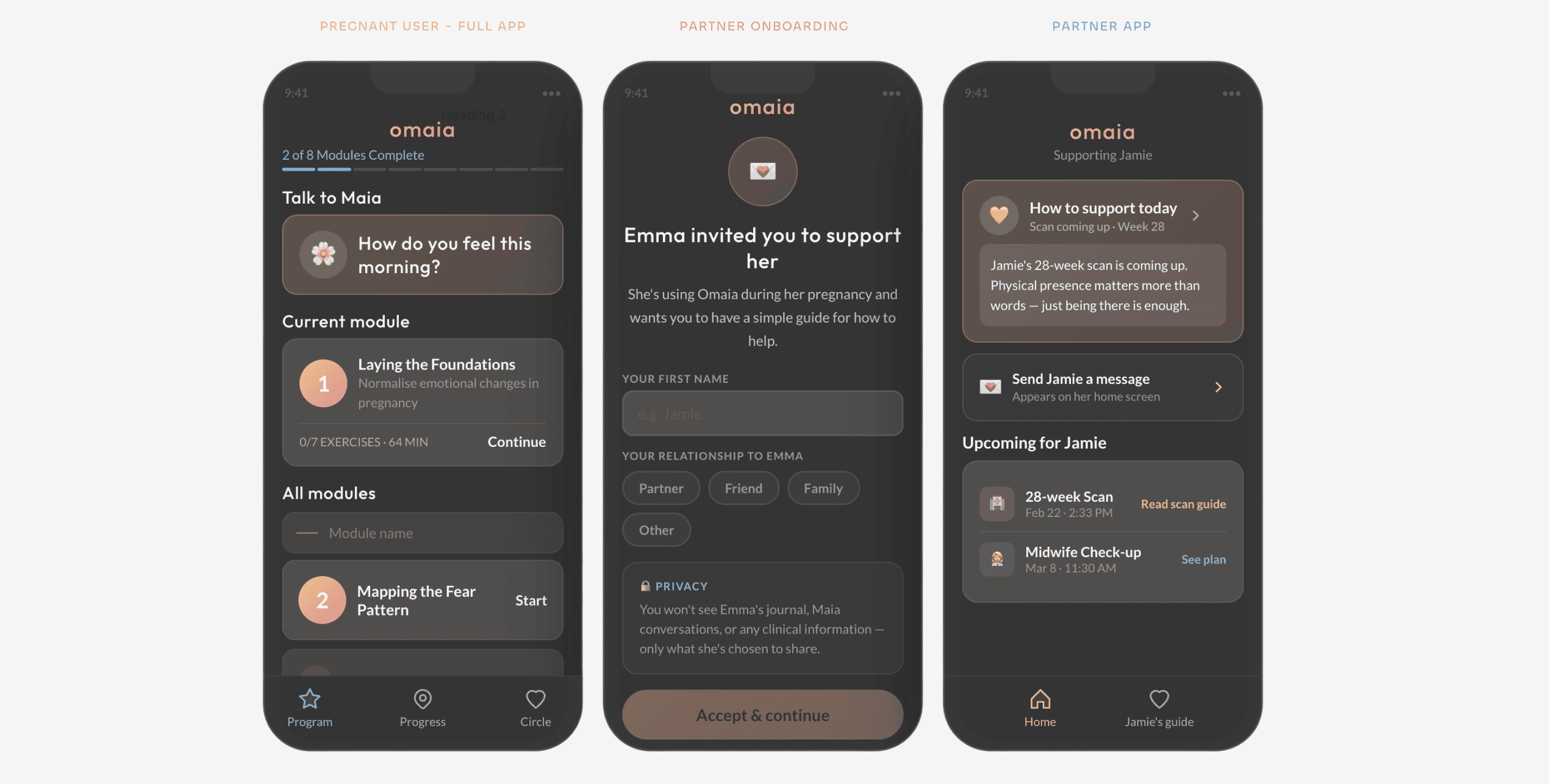
03 · Rebuilding for Beta
Working with the therapist, I translated clinical objectives into short product interactions: one focused goal, manageable steps, supportive prompts, a clear sense of completion.
Rather than one uniform programme, we structured it around distinct anxiety profiles — which shaped onboarding, exercise pathways, recommendations and progression.
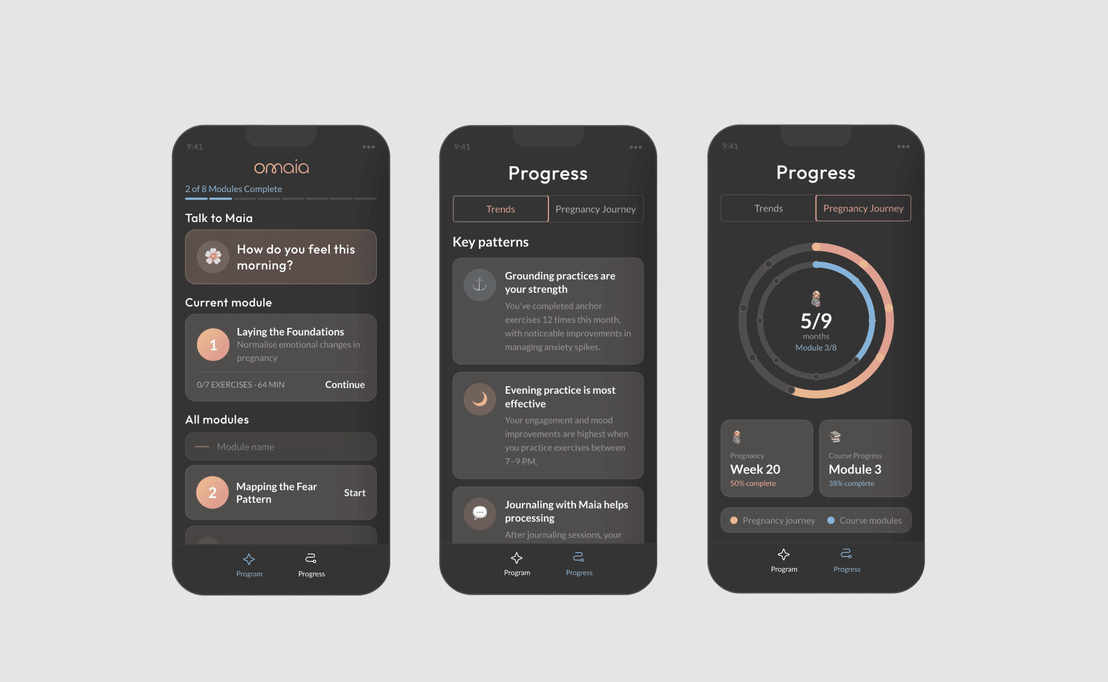
New architecture:
Home — immediate support and the next useful action
Trends — emotional patterns made understandable
Pregnancy — relevant context, without the baby dominating the experience
I built the full visual system: typography, colour, components, exercise patterns, navigation, interaction states. Accessibility ran through contrast, readable type, large touch targets and progressive disclosure.
04 · Designing Maia's behaviour
The hard part wasn't the chat screen. It was deciding how the system should respond when someone expresses fear in a sensitive health context.
Working with developers and clinical contributors, I defined when Maia should listen, validate, suggest an exercise, or direct someone toward human support. Responses were grounded in clinician-reviewed content, and higher-risk messages were routed to a safety flow rather than a normal reply.
Designing Maia meant defining what she must not do as carefully as what she should.
Maia offers emotional support and does not replace medical care.
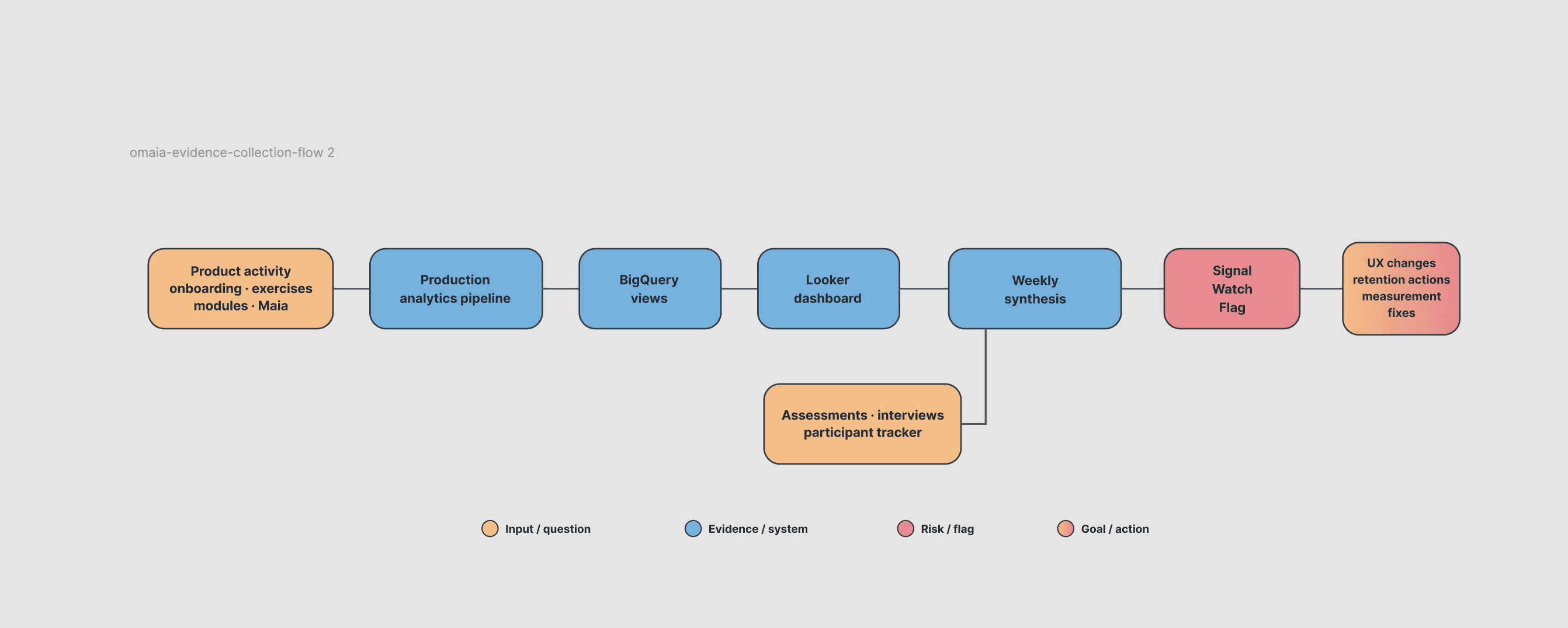
05 · Building validation into the Beta
As Beta approached, my scope grew from designing the product to owning its UX testing and MVP validation.
Two questions drove the model: Did users return and progress? Did users feel emotionally supported?
Three evidence streams answered them:

Behavioural — onboarding, exercise completion, programme progression, drop-off, Maia usage
Emotional — baseline and follow-up assessments, reflections, perceived helpfulness
Qualitative — interviews explaining why users engaged or disengaged
I defined what needed measuring and worked with engineering to make product activity accessible through BigQuery views and Looker. Each week I reviewed behavioural data against assessments, participant tracking and qualitative feedback — necessary, because no single source gave a complete picture.
No single source was treated as the complete truth.
Holding conclusions provisional
Analytics can be wrong in ways that look exactly like user behaviour. When numbers pointed somewhere unexpected, my instinct was to verify the pipeline before rewriting the product story — because a measurement problem and a product-engagement problem require completely different responses, and acting on the wrong diagnosis costs a team weeks.
Knowing which one you have is the job.
I reported evidence weekly in three states: Signal (supports the direction) · Watch (needs observation) · Flag (needs a decision). Each finding appeared once, in one state — so the team always knew what needed attention versus what was simply worth watching.
06 · An early insight became Support Circle
In Alpha interviews, users kept describing the moment they reach for a partner, friend or family member when anxiety spikes.
I proposed extending Omaia beyond an individual experience. It was parked while we focused on the core product, then returned months later. I designed Support Circle — letting a pregnant user invite one trusted person into a limited, user-controlled part of the app.
Invitation and onboarding for both participants · separate views per role · information and permission boundaries · relevant prompts and support actions · open questions for clinical review.
Delivered as a high-fidelity prototype, presentation and written specification. A future concept, not a shipped feature.
07 · Result
Omaia moved from an early proposition to a coherent product in closed beta, with a validation system built around it.
The team came away with two things: a product to test, and a clearer way to understand what the testing actually showed. My final report separated what the evidence supported, what remained uncertain, and what needed to change before the next validation round.
Takeaways
Research should visibly change the product. Not just polish it.
Sensitive products need clear boundaries, not only friendly interfaces. Defining what the AI must not do mattered more than the chat UI.
Saying what remains unknown is part of good design. An honest "we don't know yet" is more useful to a team than a confident number.
Building the process is part of the work. In an early-stage context, deciding what needed measuring — and what didn't — mattered as much as designing the thing being measured.
Selected screens and prototype available on request.