Waterboyz
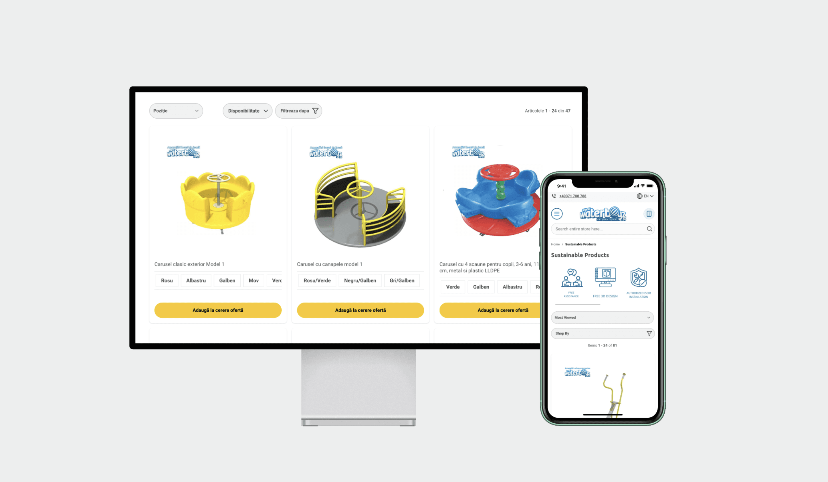
I worked as a UX/UI collaborator alongside a marketing agency and the client's design and development teams, improving product discoverability, navigation and visual consistency across a wide, technical catalogue.
Role UX/UI Designer & UX Strategist (collaborator)
Timeline Periodic collaboration across 12 months · 2024
Team CEOs, marketing agency, product designers, front-end developers
Live waterboyz.ro
How I worked
I collaborated with the marketing agency and the in-house design and development teams, contributing to category, product and landing pages, navigation and mega-menu structure, category hierarchy and naming, and reusable patterns and handoff documentation.
01 · The challenge
One catalogue, two very different buyers.
Waterboyz serves B2B and B2C at once — city planners, schools and businesses on one side; parents, event organisers and recreational buyers on the other. A procurement officer specifying playground equipment and a parent browsing inflatables need the same site to behave differently.
The catalogue was wide and technical. It had to become easier to browse, compare and understand without the interface getting heavier — and it had to stay scalable as the product range grew.
02 · Approach
Working across teams. I collaborated with the marketing agency on brand direction and messaging, with developers on feasibility and UI edge cases, and with the other designers to keep patterns shared rather than duplicated. My contributions sat inside that shared effort rather than alongside it.
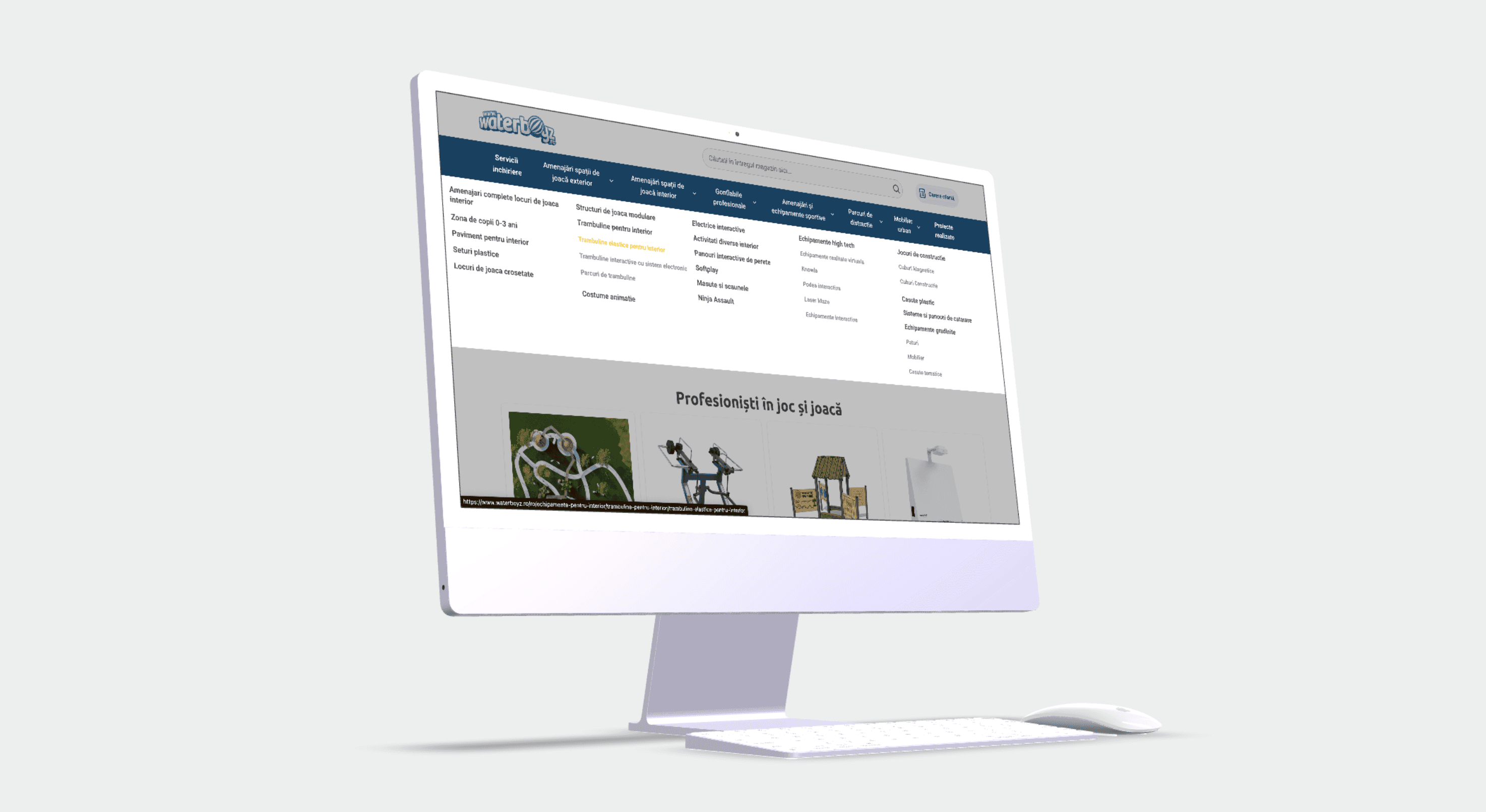
Navigation and discoverability. I contributed to reorganising the category structure and product hierarchy, improved naming conventions and browsing logic, and refined mega-menu behaviour and filters so users reached relevant products faster — whichever route they came in by.
E-commerce UX/UI. Product pages, category layouts, cards, buttons, tags, CTAs and responsive components, designed for clarity first and conversion as a consequence of it. Technical specifications had to be available without dominating the browsing experience.
Scalable design support. Reusable patterns and clearer handoff documentation, so the platform could absorb new products and content without drifting out of visual or structural consistency. On a catalogue this size, consistency is a maintenance problem, not a styling one.
03 · Result
Navigation and product discoverability improved across a complex catalogue
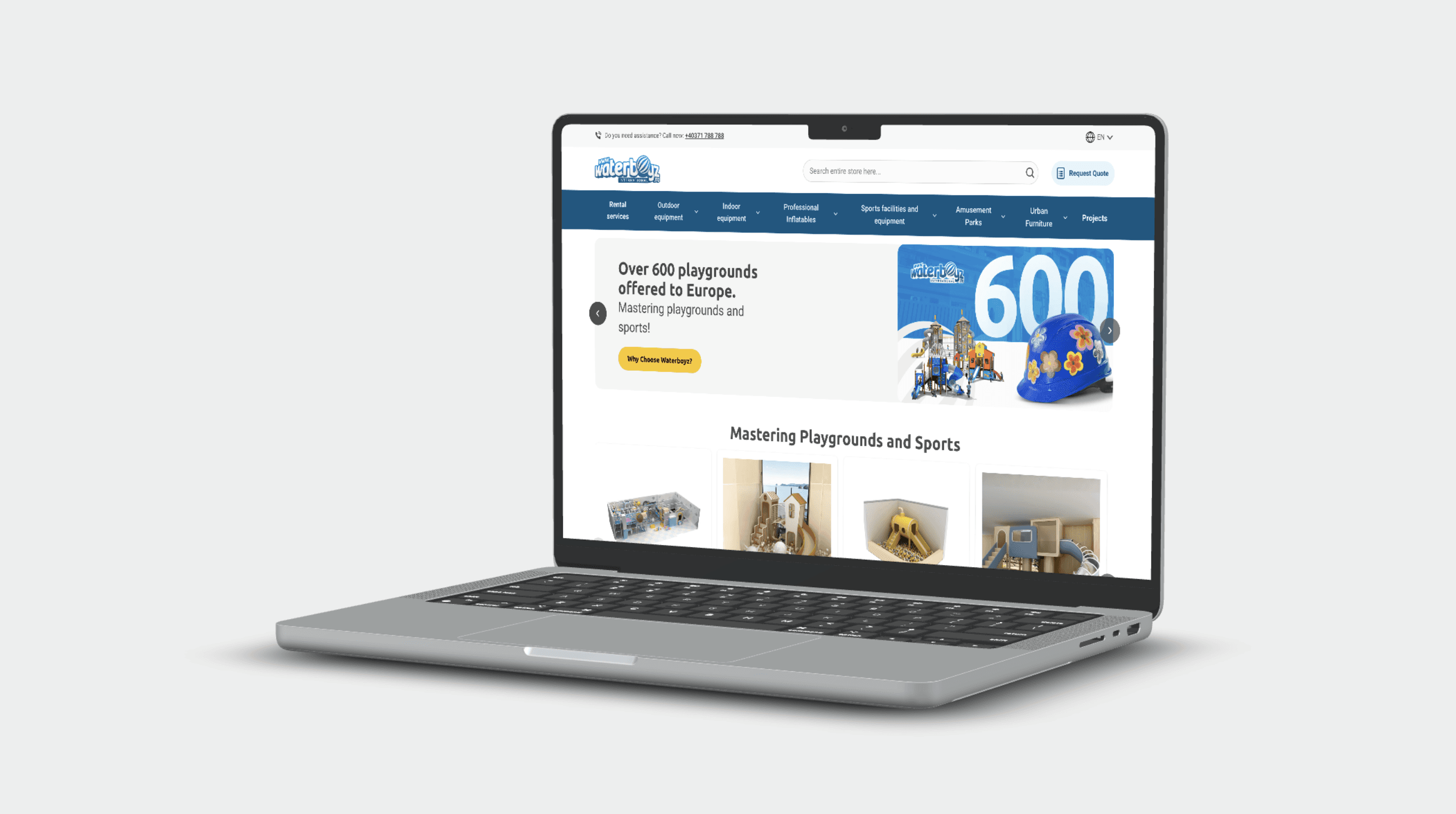
Clearer, more consistent e-commerce interface across key page types
Better browsing for both technical and recreational product lines
Stronger alignment between marketing, design and development
A more scalable structure for future product and content expansion
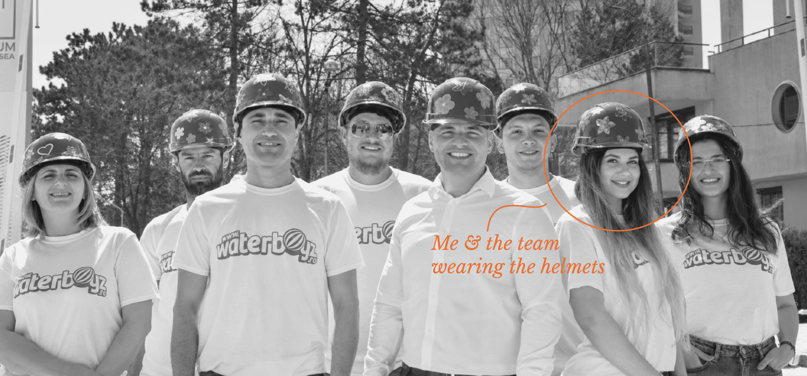
A note outside the brief: I suggested decorating the team's safety helmets with hand-drawn flowers as a bonding exercise. It turned into a company photo — playful, and closer to the brand's own personality than anything in the style guide.
Takeaways
Information architecture is the design work on a large catalogue. Naming and hierarchy decided more about discoverability than any layout choice.
Two audiences, one interface. Serving B2B and B2C meant designing browsing paths that diverge early rather than building a compromise that suited neither.
Consistency needs infrastructure. With multiple designers, an agency and a dev team touching the same product, reusable patterns and documentation were what actually held the interface together.
Skills
E-commerce UX/UI · Information architecture · Navigation design · Responsive design · UI components · Product discoverability · UX audit · Service design thinking · Developer handoff · Cross-functional collaboration